Annual Report Brochures for UK Charities
Posted by By Jenny on 9th Nov 2026


Posted by By Jenny on 9th Nov 2026
You're about to send your charity's annual report to the printer, and a nagging question surfaces: will the finished brochure actually communicate your mission, or will it end up in a desk drawer? For UK charities, the annual report brochure is far more than a compliance document. It is a fundraising tool, a trust-building asset, and a physical statement of your values.
This guide covers everything you need to know about choosing the right brochure format, paper stock, finish, and binding for your charity's annual report. From accessibility and sustainability to print specifications and stakeholder engagement, every decision shapes how donors, trustees, and the wider community experience your impact story. Wee Print helps UK charities translate those decisions into press-ready brochures with in-house design support and 2-working-day UK delivery.


An annual report brochure is a printed document that communicates your charity's achievements, financial health, and future plans to stakeholders over a defined period, usually twelve months. It goes beyond the statutory trustees' annual report by presenting impact data, beneficiary stories, and strategic reflections in a designed, reader-friendly format.
The Charity Commission requires all registered charities to prepare a trustees' annual report. Charities with income over £25,000 must file it officially. A standalone printed brochure, though, serves a different purpose: it builds trust with donors, supports grant applications, and gives your team a tangible document to share at events, AGMs, and community meetings.
Printed brochures carry a weight that digital PDFs cannot replicate. When a major donor picks up a 250gsm silk-cover brochure at your gala, they experience your charity's professionalism through texture, colour, and layout. That physical interaction creates a credibility signal that a screen simply does not deliver.

Most charities write their annual report for one audience and wonder why others ignore it. In practice, your brochure must serve at least five groups, each reading it differently.
Trustees and board members: They read cover-to-cover. They need outcomes measured against targets, financial summaries, and honest reflection on challenges. Clear data tables and programme breakdowns serve them well.
Funders and grant-makers: They skim until they find the programme they funded, then read that section closely. Structure your brochure so each programme section stands alone, with its own headline outcomes and case study.
Individual donors: They look at photographs first, read beneficiary stories second, and scan headline numbers third. Compelling imagery and short narrative blocks are essential for this audience.
Beneficiaries and communities: They want authentic representation and honest reflection. Accessibility matters here: clear fonts, sufficient colour contrast, and plain language throughout.
The public and media: They may only see excerpts shared on social media. Design your "year in numbers" spread so it works as a standalone image when shared digitally.

Format decisions determine how your report feels in someone's hands. UK charities typically choose from three main brochure formats, each suited to a different scale of reporting.
Saddle stitching uses wire staples along the spine fold. It works for reports up to about 48 pages and is the most cost-effective binding method. Many smaller charities with income under £500,000 find that a well-designed 12 to 24-page saddle-stitched booklet covers all their reporting needs without padding. Wee Print produces saddle-stitched booklets with full-colour printing and custom page counts.
Perfect binding uses adhesive along the spine, creating a flat, professional edge. This method suits thicker reports with 40 pages or more. Larger charities reporting on multiple programmes, international operations, or complex financial structures often need this format to accommodate detailed programme sections, data visualisations, and contributor acknowledgements.
Wiro binding uses a metal loop along one edge, allowing pages to lie completely flat. This format suits reports that double as reference guides, training manuals, or programme handbooks. It is particularly practical for internal distribution at board meetings where trustees annotate pages and flip between sections.

Paper choice affects how your brochure looks, feels, and communicates your charity's values. Three specifications matter most: weight (gsm), coating, and environmental credentials.
Cover stock: A 300gsm to 350gsm card stock gives your annual report a substantial, professional feel. Heavier covers protect interior pages during handling and mailing, and they create a clear distinction between the cover and the content inside.
Interior pages: For text-heavy sections with data tables and charts, 130gsm to 170gsm silk or matt coated paper delivers sharp image reproduction and comfortable readability. If your report includes photography-led spreads, 170gsm offers enough rigidity to prevent show-through from images printed on the reverse side.
Silk and matt coated: These finishes reduce glare while maintaining colour vibrancy. They are the most popular choice for charity annual reports because they balance readability with visual impact. Matt coated stock also takes handwritten annotations well, useful for trustees reviewing the document in board meetings.
Gloss coated: This finish makes photographs and infographics vivid but can cause glare under overhead lighting. It suits image-heavy reports where photography is the primary storytelling device.
Uncoated: This stock has a natural, textured feel that many charities associate with authenticity and environmental responsibility. Colour reproduction is softer on uncoated paper, so your designer should adjust the colour profile during artwork preparation. Uncoated stocks pair well with charities whose brand identity leans toward warmth and approachability.
Many charity stakeholders expect environmental responsibility from the organisations they support. Choosing post-consumer recycled (PCW) stock or FSC-certified paper demonstrates that commitment in a tangible way. Modern recycled stocks, particularly those rated 100% PCW at 300gsm or above, provide structural rigidity comparable to virgin-fibre card.
Colour rendering on recycled and kraft stocks can differ from standard coated paper. Whites may appear slightly warmer, and deep blacks may look marginally softer. Discuss these trade-offs with your print partner early in the design process so your designer can optimise the artwork accordingly. Sustainable printing does not mean sacrificing quality, but it does require a few upfront conversations about stock behaviour.

Finishing options add tactile and visual impact to your annual report. They also carry cost implications, so choose finishes that reinforce your charity's brand without inflating the budget beyond what your trustees would approve.
Matt or soft-touch lamination on the cover adds durability and a tactile quality. Soft-touch lamination creates a velvety texture that signals professionalism. Gloss lamination makes cover imagery pop but fingerprints show more easily. For annual reports that will be handled at events, AGMs, and funder meetings, matt lamination is usually the safer choice.
Spot UV applies a glossy transparent coating to specific design elements on the cover, such as your charity logo, a key statistic, or a headline photograph. The contrast between a matt-laminated background and a glossy spot UV element draws the reader's eye to important details. This finish works well on the cover but is rarely necessary on interior pages.
Foil stamping adds a metallic or coloured foil to specific areas. Embossing creates a raised texture. Both finishes convey a sense of prestige, and they work particularly well for anniversary reports, milestone celebrations, or reports presented at formal events. They do require additional setup, so discuss quantities and positioning with your printer to manage costs effectively.
Accessibility is both a legal obligation and a moral one for UK charities. The Equality Act 2010 requires organisations to make reasonable adjustments so disabled people can access information. The NHS England Accessible Information Standard provides detailed guidance that charities can adapt for their own printed communications.
Use a minimum body text size of 12pt, with 14pt preferred for maximum readability across audiences. Sans-serif typefaces like Arial, Helvetica, or Calibri are easier to read for people with visual impairments or learning disabilities. Avoid decorative fonts in body copy; reserve them for headlines only if they are part of your brand identity.
Ensure sufficient contrast between text and background colours. Dark text on a light background is the standard approach. Avoid placing text over busy photographs or patterned backgrounds without a solid-colour text box behind it. Leave generous white space between sections. Cramped layouts are harder to read for everyone, not only people with visual impairments.
Consider producing your annual report in multiple formats: a printed brochure for general distribution, a large-print version for people who need it, and an accessible digital version (HTML, not just PDF) for screen reader users. Mentioning these alternative formats in your printed brochure shows donors and beneficiaries that your charity takes inclusion seriously.
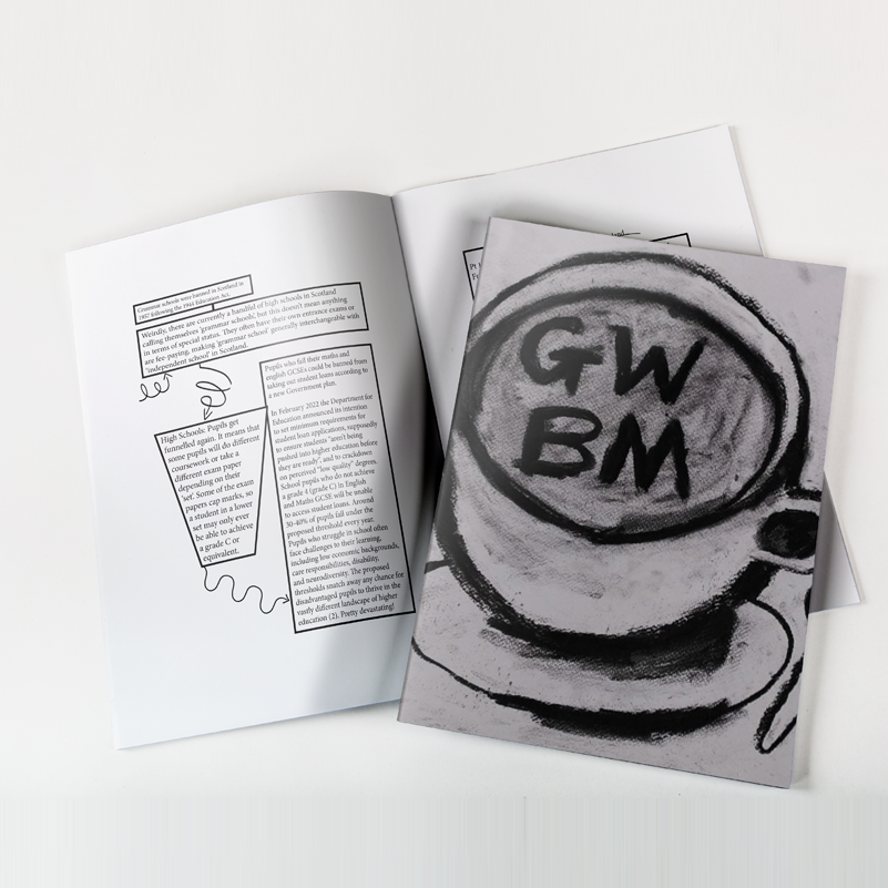
Structure determines whether your report gets read or shelved. A layered approach serves all five audiences identified earlier. Each section should stand alone so a funder can read one programme section without needing context from elsewhere in the document.
Your cover should include your charity name, the reporting year, one compelling photograph, and one headline statistic. Keep it clean. A contents page is essential for any report over ten pages, with clear page numbers and programme headings.
A personal reflection on the year, written in first person, builds trust. Include honest acknowledgement of challenges alongside achievements. Research consistently shows that charities reporting transparently about setbacks earn greater trust from funders and donors.
Design a one or two-page infographic spread featuring 8 to 12 key statistics. This is the most shared section on social media, so ensure it works as a standalone visual. Use bold numbers, clear labels, and minimal body text. This spread often becomes the centrepiece that justifies the entire print run.
Each programme or service area gets its own section with: what you set out to achieve, what you actually achieved (with data), how many people you reached, and at least one beneficiary story told with consent. Lead with outcomes rather than outputs. "87% of workshop participants reported improved confidence" tells a funder far more than "we ran 200 workshops."
Present income and expenditure using clear pie charts or bar graphs. Link spending to programmes where possible, showing cost-per-outcome or cost-per-beneficiary. This section does not replace your audited accounts, but it makes financial information accessible to non-financial readers.
List funders, partners, and major donors with permission. Public recognition is a retention mechanism: donors who see their name or logo in print are more likely to give again. For fundraising materials, this section quietly does double duty as a stewardship tool.
When briefing your print partner, provide these specifications upfront to avoid delays and reprints.
Page count: Confirm your final page count early. Saddle-stitched booklets require page counts in multiples of four. Perfect-bound reports are more flexible but still benefit from early pagination planning.
Bleed and safe area: Supply artwork with a minimum 3mm bleed on all edges. Keep critical text and logos at least 4mm inside the trim line. These margins prevent important content from being cut during production.
Colour mode: Supply all files in CMYK colour mode. RGB files designed for screens will shift colour when converted for print, and logos may appear noticeably different. Ask your designer to soft-proof the artwork before final submission.
Image resolution: All photographs and graphics should be at least 300 DPI at their printed size. Low-resolution images look sharp on screen but appear pixelated in print, undermining the professional impression your report should create.
Artwork checks: A good print partner will check your files before they go to press. Wee Print's in-house design service can review and adjust artwork, ensuring your files are press-ready and correctly set up for the specified stock and binding.

UK charity donors and funders increasingly scrutinise environmental practices. Your annual report brochure is an opportunity to demonstrate that your charity's values extend to its operational decisions.
FSC-certified paper confirms that the wood fibre originates from responsibly managed forests or verified recycled sources. The FSC label on your printed brochure gives stakeholders independent verification of your sourcing choice, unlike a vague "sustainably sourced" claim that carries no certification behind it.
Recycled stocks have improved dramatically. A 350gsm recycled card stock can provide the same structural rigidity as virgin-fibre equivalents. Colour accuracy on recycled uncoated paper may require slight design adjustments, particularly for photographs with wide tonal ranges. Discuss these considerations with your printer during the proofing stage.
Wee Print's environmental policy reflects a practical approach to eco-conscious production, offering recycled stock options alongside standard ranges. Choosing recycled does not mean compromising on the finished result; it means planning the artwork with the stock behaviour in mind.
Order only what you need. Digital printing technology makes smaller runs viable without excessive per-unit costs, reducing both waste and storage requirements. If your charity distributes reports at a single AGM plus a handful of funder meetings, a run of 200 to 500 copies may be more practical than 2,000. Discuss your distribution plan with your print partner to find the right quantity.
Timing is everything. A report published nine months after your financial year-end loses most of its relevance. Aim to have your printed brochure in hand within three months of your year-end.
Month 1 (post year-end): Compile programme data, gather beneficiary stories and photographs, and draft copy for each section. If you have been collecting stories throughout the year, this stage is significantly faster.
Month 2: Design, internal review, and sign-off. Allow at least two rounds of review by your communications team, CEO, and board chair. Each round should take no more than five working days.
Month 3: Proofing, print production, and delivery. Request a printed proof before the full run. With Wee Print's booklet production, standard orders ship within 2 working days of artwork approval, so build your timeline around that turnaround.
Having reviewed how charity reports succeed, it is equally important to flag the pitfalls that undermine even well-intentioned publications.
Reporting outputs instead of outcomes: "We ran 150 sessions" tells the reader nothing about impact. "73% of participants reported improved wellbeing after completing the programme" tells them everything. Always lead with what changed, not what you did.
Ignoring accessibility: A 40-page PDF with tiny fonts, low contrast, and no alt text excludes a significant portion of your audience. Scope estimates that around 1 in 4 people in the UK are disabled. Design your printed materials with accessibility from the start, not as an afterthought.
Padding the report: Every page should earn its place. If a section does not change someone's understanding or prompt a decision, cut it. A focused 16-page brochure printed on quality stock conveys more professionalism than a 48-page document filled with filler.
Choosing the wrong stock: Lightweight paper makes your report feel disposable. An annual report printed on 100gsm copy paper does not signal the care and investment your charity put into the work it describes. Specify appropriate gsm weights for both cover and interior pages.
Wee Print provides a complete brochure production service for UK charities, from artwork preparation to finished delivery. As a print and design studio based in Alloa, Scotland, we understand the practical challenges nonprofits face when producing annual reports on tight budgets and tighter timelines.
Custom specifications: Choose your page count, paper stock, binding method, and finishing options. Whether you need a 12-page saddle-stitched booklet or a 60-page perfect-bound report with spot UV on the cover, the production is tailored to your requirements.
In-house design support: If your charity does not have a dedicated designer, our in-house team can prepare your press-ready artwork from your supplied content. We check bleed, safe areas, colour profiles, and image resolution before anything goes to press.
UK-wide delivery: Standard orders dispatch with free delivery to UK mainland addresses. For time-sensitive projects, Wee Print's production workflow is built around a 2-working-day turnaround from artwork approval, keeping your publication timeline on track.
Coordinated print campaigns: Your annual report does not exist in isolation. Pair it with complementary materials, such as donor appeal flyers, event posters, and branded stationery, all produced with consistent branding from a single print partner.
Your annual report brochure is one of the most important printed documents your charity produces each year. The decisions you make about format, paper, finish, and accessibility shape how trustees, funders, donors, and the public perceive your organisation's impact and professionalism.
Start with your audience. Match the format and binding to your page count and distribution plan. Specify paper weights and finishes that reflect your charity's values, particularly around sustainability and accessibility. Build your timeline around a three-month production window, and work with a print partner who checks your files, advises on stock choices, and delivers on schedule.
Get in touch with our team at Wee Print to start planning your charity's next annual report brochure. We will help you translate your impact story into a printed document your stakeholders will actually read.
Use 300gsm to 350gsm card stock for your cover and 130gsm to 170gsm coated paper for interior pages. Heavier cover stock protects the brochure during handling and creates a professional feel that signals care and investment in your charity's public communications.
Yes. Modern post-consumer recycled stocks at 300gsm and above deliver comparable rigidity and colour reproduction to virgin-fibre paper. Slight colour warmth on uncoated recycled stocks may require minor design adjustments. Wee Print offers recycled stock options alongside standard ranges to suit your charity's sustainability goals.
There is no fixed rule. Charities with income over £500,000 typically produce 20 to 30 pages. Smaller organisations often find 8 to 16 pages sufficient. Focus on covering outcomes, beneficiary stories, financial data, and learning rather than padding to reach a specific length.
Saddle stitching is the most cost-effective binding for reports up to about 48 pages. It uses wire staples along the spine fold and produces a clean, professional result. Wee Print's saddle-stitched booklets support custom page counts, paper stocks, and full-colour printing throughout.
The Equality Act 2010 requires organisations to make reasonable adjustments for disabled people. For printed brochures, this means using readable font sizes (minimum 12pt, preferably 14pt), sufficient colour contrast, sans-serif typefaces, and clear layout with generous white space. Offering alternative formats on request strengthens your compliance position.
Once artwork is approved, Wee Print dispatches standard brochure orders within 2 working days, with free UK mainland delivery. Allow 2 to 3 months from your financial year-end for the full process: data compilation, copywriting, design, review, proofing, and print production.
Both. A printed brochure serves trustees, major donors, and event attendees who value a tangible document. A digital version extends your reach online and supports accessibility through screen readers. The most effective approach is a designed print brochure plus an accessible HTML or PDF version for broader distribution.