
As an experienced graphic designer and printer, I’ve seen countless businesses make the same mistake: treating their business card as an afterthought. They focus all their energy on their website and digital marketing, only to fall flat when it comes to the tangible exchange of a card. But let me tell you, your business card printing is one of the most powerful and personal marketing tools you possess. It’s the physical anchor of your brand, and a brilliant design business card printing project will ensure that first impression is a memorable one.
The best business cards aren't just vehicles for contact details; they are miniature advertisements that communicate your brand values the moment they are held. So, what’s the secret to moving beyond the basic template and achieving a professional, impactful result? It starts with the design.
Foundation: Information Hierarchy is Key
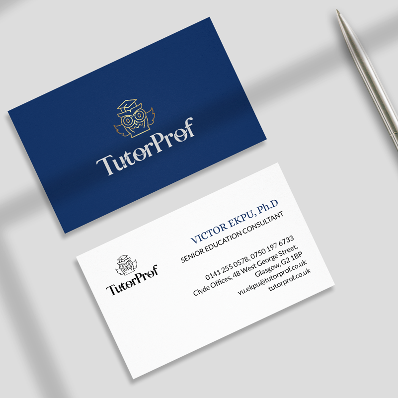
The first step in any successful printing business card design is deciding what to include—and, crucially, what to leave out. Every piece of information must earn its place. The essentials are your name, title, company name/logo, phone number, and email. While you may be tempted to cram your card full of every service you offer, fight that urge.
Your design should create a clear hierarchy. Your name and logo should be the focal point, guiding the recipient's eye. Remember, simplicity always wins. If you want to include a lot of information, consider using both sides of the card. When setting up a business card print design, we always recommend plenty of white space to give the vital information room to breathe.
I once worked with a lawyer who insisted on printing their entire list of practice areas on the card. The resulting text was so tiny and cluttered that it looked more like a legal disclaimer than a professional introduction. We streamlined it, using a clean layout for the front and listing just two key areas of specialisation on the back. The clarity immediately made the card feel more authoritative.
The Art of Visual Branding
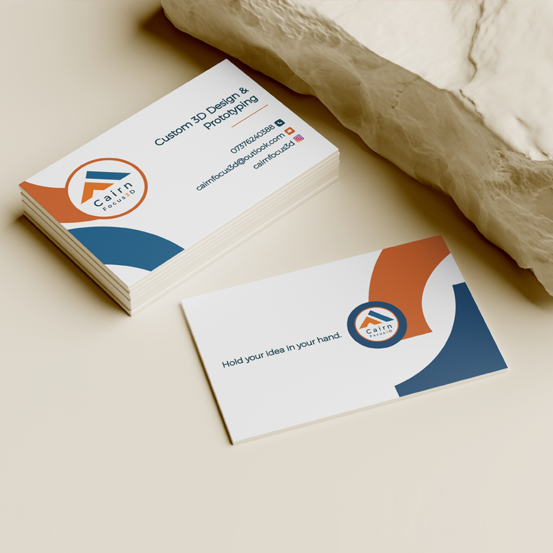
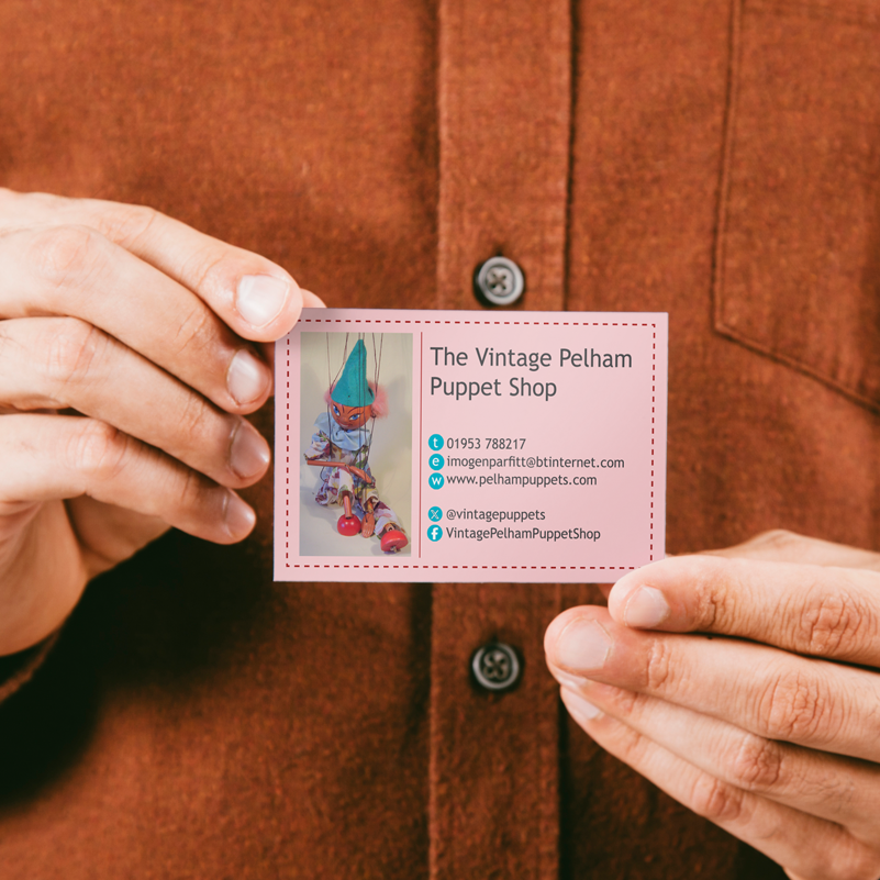
Your card is a direct extension of your overall brand. If your website uses a vibrant teal and a clean sans-serif font, your card must reflect that. Card photo printing should only be considered if the image is high resolution and relevant to your brand; otherwise, stick to strong branding elements.
Colour theory plays a huge role. Are you a serious, finance-based firm? Dark blues and metallics convey trust. Are you a creative agency? Don’t be afraid of bold, unexpected colour combinations. But most importantly, ensure the colours you choose will translate correctly in the final printing to card process. Always ask your printer about CMYK vs. RGB colour matching.
Print Essentials: Getting it Right First Time
A beautiful design can be ruined by poor file setup. Always design your card at 300dpi (dots per inch) resolution and ensure your design includes 'bleed'. Bleed is a small margin that extends past the trim edge, ensuring that when the card for printing is cut, you don't end up with ugly white borders. This attention to detail is essential for any high-quality custom card printing.
When you’re ready to send the file to your supplier, make sure you know exactly what material they will use. Choosing the right paper for printing cards is a major part of the design process.
Material Matters: Choosing the Right Stock
The physical feel of the card is a huge indicator of quality. We use GSM (grams per square metre) to measure card weight. A standard corporate card should be at least 350gsm. Anything less feels cheap.
You’ll need to choose a finish for your print on card paper:
-
Gloss: Offers a high shine, making colours very vibrant.
-
Matte/Silk: A softer, more sophisticated option that is easier to write on.
-
Uncoated: Often used for recycled or raw-look stock, giving a tactile, natural feel.
Special effects like spot UV (a varnish applied only to certain areas, like the logo) or foil blocking (metallic stamping) can make your printing a card truly stand out from the crowd. These finishes transform standard card printing into a luxury item.
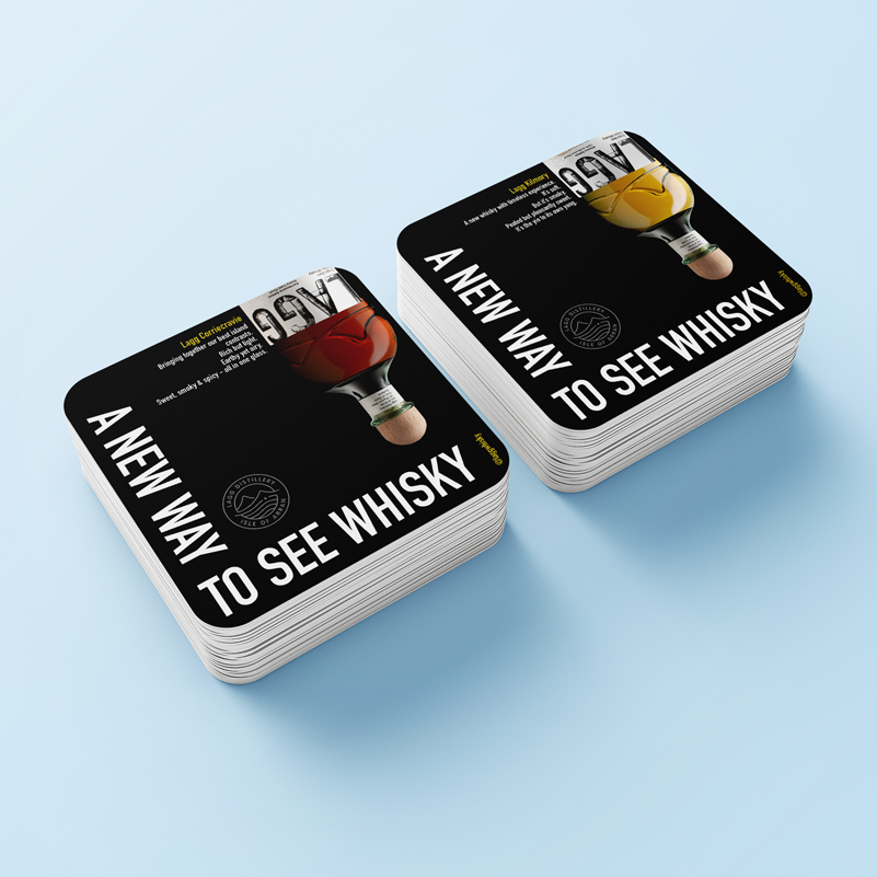
Design Beyond the Standard Rectangle
While a rectangle is classic, don't overlook other ways to make an impression. Die-cutting allows you to create unique shapes that instantly grab attention. Flyer and business card printing can be combined into a single, cohesive package, offering a cost-effective way to get more information out there.
And remember, your branding needs extend beyond the initial exchange. For events, consider professional place card printing or card invitation printing that matches your corporate aesthetic. If you offer loyalty rewards, high-quality gift card printing adds a layer of professionalism that cheap, generic cards simply can’t match. Consistency across all these mediums, from poster card printing to printing invitation cards, reinforces your brand identity.
I always advise clients that a strong brand is about consistency. I recently worked with a café owner who had great business cards, but their loyalty cards and posters looked completely different. We redesigned them to match the feel of the business card, and within a month, they reported a noticeable increase in customers mentioning how 'put together' their brand felt.
Invest in Your First Impression
Ultimately, a truly effective business card is the result of collaboration between a thoughtful designer (which might be you!) and a reliable printer. Don't skimp on quality; the investment in superior custom card printing and strong design business card printing will repay itself many times over in the professional image you project. Make sure the card you hand over is one they won't want to throw away.
![]()
FREQUENTLY ASKED QUESTIONS (FAQ)
Q:1: What is the ideal resolution for business card design files?
For professional results, your design file should have a resolution of at least 300 dots per inch (DPI). This ensures that text and images are sharp and clear when printed and avoids a blurry or pixelated appearance.
Q:2: What is the difference between gloss and matte finish?
A gloss finish gives your business card a shiny, reflective surface that makes colours appear more vibrant and adds a professional polish. A matte finish has a non-reflective, smooth surface that provides a more subtle, elegant, and modern look.
Q:3: Should I use CMYK or RGB colour mode for printing a card?
You should always use CMYK (Cyan, Magenta, Yellow, Black). RGB (Red, Green, Blue) is used for screens and digital media. If you submit an RGB file for printing, the colours will be automatically converted to CMYK, which can often lead to duller or inaccurate colour results.
Q:4: What is the benefit of double-sided business card printing?
Double-sided printing allows you to maximise available space. You can dedicate one side purely to branding (logo, tagline) and the other to essential contact information, or use the back for a secondary purpose like an appointment reminder or a QR code.
Q:5: Can I print a photo of myself on my business card?
Yes, you can use card photo printing, but ensure the photo is very high resolution (300dpi) and professionally taken. The image should be cropped and styled appropriately to maintain professionalism, as a low-quality or poorly cropped photo can detract from the card’s overall impact.
Q:6: What is a standard turnaround time for printing business cards?
The turnaround time for printing business cards can vary depending on the printer and the complexity of your order. Basic, standard printing might take as little as 1-3 business days, while cards with special finishes like foil or embossing can extend the turnaround time to 5-10 business days.
Posted by By Jenny on 28th Nov 2025