
Ah, the glorious moment when your digital masterpiece is finally ready for its tangible debut! But alas, the journey from screen to paper is fraught with peril, a veritable minefield of potential printing mishaps. Fear not, dear designers and marketers, for we’re here to illuminate the most common printing mistakes and how to avoid them, all while keeping a twinkle in our eye.
Let us embark on this quest for print perfection, shall we?
1. The Resolution Riddle: Pixelated Pandemonium
Imagine, if you will, a magnificent portrait, rendered with the finesse of a digital Rembrandt, only to emerge from the printer looking like a blurry impressionist painting. This, my friends, is the curse of insufficient resolution.
- The Mistake: Employing images with a DPI (dots per inch) that would make a pixel blush.
- The Solution: Aim for a crisp 300 DPI for your print projects. Think of it as ensuring your pixels are dressed in their Sunday best.
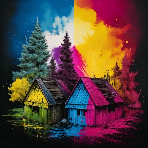
2. The Chromatic Conundrum: CMYK vs. RGB Revelations
Ah, the vibrant hues of your monitor, a symphony of RGB glory! But alas, the printer dances to a different tune, the rhythmic beats of CMYK.
- The Mistake: Expecting the radiant RGB palette to magically translate to the CMYK realm.
- The Solution: Convert your designs to CMYK before printing. It's like changing the language of your artwork so the printer understands the instruction. And always, always, get a proof.
3. The Bleed Blunder: A Trimmed Tragedy
Imagine a beautifully designed brochure, only to find a sliver of white peeking out from the edges. A design crime of epic proportions!
- The Mistake: Forgetting to add bleed, leading to unwanted white borders.
- The Solution: Add a generous 3mm (or 1/8 inch) bleed to your design. It's like giving your artwork a little extra wiggle room, just in case.
4. The Typographic Tangle: Font Follies
Ah, the elegant curves of your chosen font, a testament to your refined taste! But what’s this? A substitution? A disappearance? Oh, the horror!
- The Mistake: Neglecting to embed or outline fonts, resulting in font substitutions or missing fonts.
- The Solution: Embed those fonts or convert them to outlines. It's like ensuring your fonts are securely fastened, ready for their printed adventure.
5. The Proofing Predicament: Overlooking the Obvious
A misplaced comma, a transposed letter, a design element gone astray – these are the gremlins that lurk in the shadows of unproofed prints.
- The Mistake: Skipping the proofing stage, leading to embarrassing errors.
- The Solution: Proof, proof, and proof again! It's like having a final dress rehearsal before the grand performance.
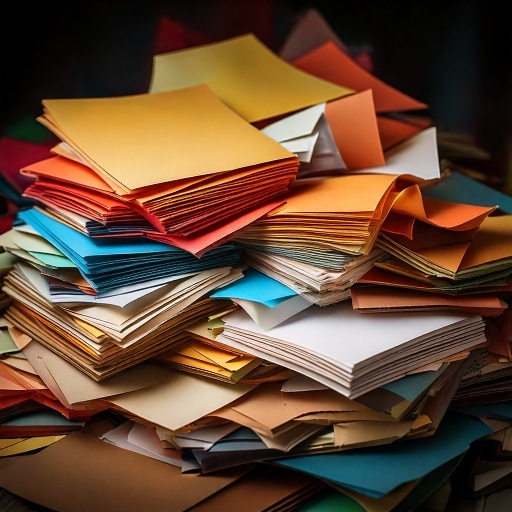
6. The Paper Panic: A Stock Selection Saga
Choosing the right paper is akin to selecting the perfect attire for your artwork. A flimsy stock for a luxury brochure? A grave mistake!
- The Mistake: Opting for a paper stock that's ill-suited for the project.
- The Solution: Consider the weight, finish, and texture of the paper. It's like dressing your artwork in the finest fabrics.

7. The File Format Fiasco: A Compatibility Catastrophe
Imagine sending a masterpiece in a format that the printer cannot decipher. A digital Tower of Babel!
- The Mistake: Sending an incompatible file format.
- The Solution: Save your artwork as a high-resolution PDF. It's the universal language of the printing world.
8. The Budgetary Blunder: The Quote Quest
Venturing into the world of printing without seeking multiple quotes is like navigating a maze blindfolded.
- The Mistake: Committing to a print job without comparing prices.
- The Solution: Request quotes from various printers. It's like shopping around for the best deal, ensuring your budget remains happily intact.
By heeding these cautionary tales, you can navigate the print minefield with confidence and a touch of whimsy. May your prints be crisp, your colours vibrant, and your designs triumphant!
FAQs: Your Printing Questions Answered
Q: What is the difference between CMYK and RGB?
A: RGB (Red, Green, Blue) is the color model used for digital screens like monitors and phones.
Q: How much bleed do I really need?
A: The standard bleed is typically 3mm (or 1/8 of an inch).
Q: My font looks different when I send it to the printer. Why?
A: This is a common issue. If the printer's computer doesn't have the exact font you used, it will substitute it with a default font, or the text may not appear at all. To avoid this, you must either "embed" the fonts in your PDF file or "outline" them (convert them to a vector shape) in your design software.
Q: What's the best file format for printing?
A: A high-resolution PDF (Portable Document Format) is generally the best choice.
Q: Do I really need a proof? Can't I just trust my screen?
A: A proof is an essential step. While your screen gives you a good idea of the design, a proof (either a digital file or a physical print) from the printer shows you exactly how the colors and layout will look on paper. It's your last chance to catch errors in text, color, and layout before the full print run begins, saving you from costly mistakes.
Q: What DPI is considered "high resolution" for print?
A: For most commercial printing, 300 DPI (dots per inch) is the industry standard.
Posted by By Jenny on 25th Mar 2025