
Artificial intelligence has completely transformed how quickly we can prototype creative ideas. With a simple prompt, you can generate dozen of visual concepts in seconds. It’s tempting to download an AI-generated image, throw some text over it, and call it a day.
However, relying on raw AI artwork as your final business flyer can actively hurt your sales, erode customer trust, and make your business look identical to everyone else.
If you want your promotional materials to actually drive foot traffic, event sign-ups, or sales, you need to understand the difference between using AI as a mood board tool and using it as a final designer.
The Hidden Cost of Publishing Raw AI Flyers
Before looking at how to use AI correctly, let's explore why hitting "download" on a raw AI graphic does more harm than good:
1. The "Synthetic Design" Problem
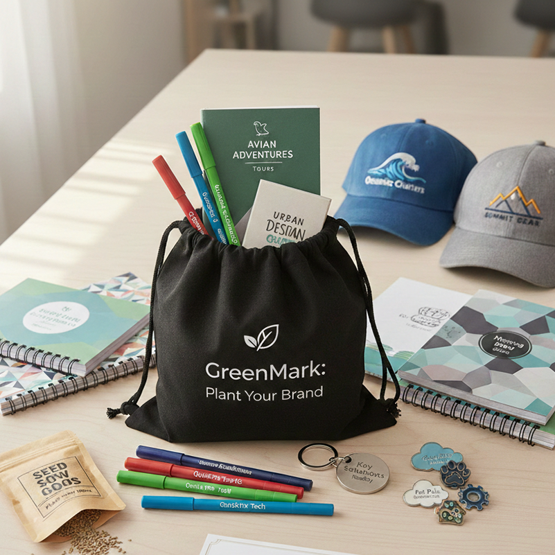
AI image generators rely on the same underlying patterns and training datasets. Because of this, raw AI graphics quickly develop a recognizable look—neon-soaked lighting, eerie glossy textures, nonsensical background elements, and chaotic letter-like shapes.
2. Lack of Visual Hierarchy
AI generates images, not structured visual messages.
3. Print & Technical Nightmares
Most AI generators export RGB raster images (JPEG/PNG) at web resolution. When you try to print these on physical paper, you run into chromatic banding, pixelation, missing vector crispness, and wrong colour profiles (CMYK vs. RGB).

4 Tips for Creating the Right Flyer Using AI as Inspiration
The goal isn't to abandon AI—it's to put AI in its proper role: a supercharged creative assistant, not the creative director.
Step 1: Use AI for Concepting and Mood Boards
Treat AI like an eager intern generating brainstorm ideas.
-
Prompt the AI for colour combinations, layout arrangements, and lighting concepts rather than full finished flyers.
-
Generate 4–5 quick visual directions to see what style fits your event or campaign, then pick the strongest direction.
Step 2: Strip Away the Noise & Establish White Space
AI naturally wants to fill every inch of a canvas with details. Good design requires room to breathe.
-
Take your AI concept and strip out 50% of the decorative chaos.
-
Ensure your flyer has one dominant focal point (e.g., your key product or headline) and plenty of white space so key details stand out in under three seconds.
Step 3: Rebuild Typography and Branding Manually
Never let an AI generator produce your text or logo.
-
Export the AI-generated background or main image element.
-
Import it into a design application (such as Canva, Adobe Express, Photoshop, or Figma).
-
Overlay your real brand fonts, official logos, and vector text elements manually to ensure crisp legibility and brand alignment.
Step 4: Ensure Real Product & Human Authenticity
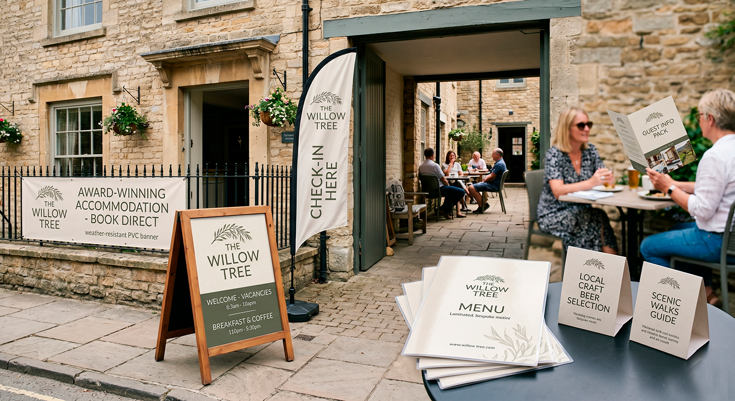
If you are selling a physical product, a specific dish, or a local service, do not use an AI image of that product.
-
Customers buy based on trust.
Showing a photo of a delicious burger that doesn't actually match what you serve builds immediate skepticism. -
Use AI for background textures, abstract shapes, or lighting, but keep your hero imagery authentic to your real business.
Quick Checklist Before You Send to Print
Before posting or printing your next promotional flyer, run through this quick human-touch check:
-
3-Second Rule: Can someone walking past understand what you’re offering, when it is, and what to do next in three seconds?
-
Brand Consistency: Are these your actual brand colours and typography?
-
Editable Text: Is all body text and key info rendered cleanly with real vector fonts?
-
Print Resolution: Is the file at 300 DPI and formatted in CMYK if printing physically?
-
Authenticity: Does this look like an intentional, human-crafted piece of design, or an automated prompt result?
Bottom Line: AI is incredible at getting you from 0 to 60% of a concept in seconds. But that remaining 40%—the human polish, precise typography, true brand identity, and clean layout—is what actually converts passersby into paying customers.
Posted by By Jenny on 17th Aug 2026